
We are keen to receive review comments for our new draft paper which is now available for open peer review here
Ole Humlum: State of the Climate 2023
This report on the state of the climate in 2023 has its focus on observations, and not on output from numerical models. The observed data series presented here reveals a vast number of natural variations. The existence of such natural climatic variations is not always fully acknowledged, and therefore often not considered in contemporary climate conversations.
Relative to the whole period since 1850/1880, 2023 was very warm, and all databases used in the present report has 2023 as the warmest year on record. A strong El Niño episode established itself during the year, rationalizing the high annual global temperature, and underlining the remarkable importance of ocean-atmosphere exchanges.
Submitted comments and contributions will be subject to a moderation process and will be published, provided they are substantive and not abusive.
Review comments should be emailed to: benny.peiser@thegwpf.org
The deadline for review comments is 5 March 2024.
—————————
Andrew Chantrill
Thank you for the opportunity to comment on Ole’s excellent report. Whilst I can see no technical errors, I am a picky so-and-so and have identified a few grammatical errors and typos:
Page 4
“This development in the global average ocean temperatures is generally reflected across the Equatorial oceans, between 30oN and 30oS, which, with exception of slight cooling at 300-500 m depth. A temperature peak may possibly have been passed around 2019-2020.”
A comma should have followed the word “depth”, not a full stop, and a lower case “a’”.
Page 5
“This bear resemblance to observed cyclic behaviour for the Southern Oscillation (SOI) and the Pacific Decadal Oscillation (PDO), respectively.”
Should read “This bears…”
Several pages
“El Niño’s” does not need the apostrophe – there is no possession, just a plural.
Page 32
Figure 27 shows the rate of change of temperature and CO2. One can calculate the correlation coefficient (R) for different leads/lags, and it appears changes in CO lag changes in temperature by about 7 months.
The same calculation can be done for CO2 and El Niños, although I’ve not done it yet.
Page 47
phenomenon’s should be phenomena
Page 51
“Greenland and Antarctica – is a more significant As already noted” should be “Greenland and Antarctica – is more significant, As already noted” – “a” deleted and full stop added.
Page 55
“However, some of the stations suggested by Holgate has not reported” should be “However, some of the stations suggested by Holgate have not reported”
Page 67
“The damage potential of a hurricane is proportional to the square or cube of the maximum wind speed”. Which?
—————
Professor Samuel Furfari
I really enjoyed reading this excellent document, which is so full of information and explanations.
For people who are not familiar with the El Niño and La Niña phenomena, would it be possible to include a relatively simple explanation of these phenomena in a footnote, as they appear very often throughout the document?
This sentence might be clearer: ‘The record of El Niño and La Niña episodes since 1950 is influenced by a significant 3.6-year cycle, and feasibly also by a 5.6-year cycle.’
Is there a weblink for this sentence: ‘Fourier frequency analysis shows the global precipitation anomaly to be influenced by 3.6- and 5.6-year cycles?’
—————
Dr. James P. Wallace III
I think Ole’s work is, and has been, outstanding. My team particularly appreciated his also pointing out the serious credibility problems with the NOAA, NASA and Hadley CRU data. This fact by itself calls into very serious question EPA’s 2009 GHG EF.
More generally, now I think we will all need to pay more attention to the impacts of Tonga-type volcanic activity which cause warming rather the cooling. How much the recent warming is due to it, since solar activity has been down dramatically for some time now?
———————–
Jim O’Brian
I’d like to make following comments, which I think will improve the quality of the Report.
Temperature Observations:
When saying “warmest on record”, is that referenced to 1979, 1850, or as the alarmists like to say, for 125,000 years?
I prefer avoid the expressions “very warm” or “very high” – can these be expressed numerically instead?
Looking at the graphs, is the temp increment in 2023 any/much greater than the previous 1998 and 2016 El Niño increments?
In my view, it would be good to add your best estimate of the likely range temp rise to 2100, based on the various datasets.
The observation on the 2020 COVID-related CO2 reduction is a hugely important lesson on the non-impact of mitigation.
Natural Variability:
You comment on natural variability cycles of 3.6 and 5.6 years – this is most interesting…….
Nicola Scafetta has done a lot of work in that area, tracing climatic cyclicality to planetary motions, as I mentioned separately.
This is a fundamental area quite deliberately untouched by IPCC and which must be important to understanding climate variability.
There is also the lack of objective research into the possible impacts of volcanic eruptions, earthquakes, etc.
Are these the fundamental cause of El Niño/La Niña natural variability, or it also the sun and the other planets?
Oceans:
There appears to be no evidence whatsoever of “boiling oceans”! Quite the contrary.
Sea Level:
It continues to baffle me why satellite altimetry data and tide gauge data have not yet been reconciled!
It seems so apparent that satellites have a x2 error, being exactly twice the tide gauge data?
Either way, the sea level rise by 2100 is an insignificant 25cm or less, important to quantify.
Ice Trends:
The noted trends in both Arctic and Antarctic seem to have very valid weather (not climatic) explanations.
By its absence, is there anything significant happening in Greenland?
Snow Cover:
Again, while there are some seasonal trends, snow is certainly not disappearing!
Precipitation Trends:
Your data seems to disprove the general view that precipitation is now increasing – is that true?
Is there any evidence of the Hunga Tonga sub-sea eruption contributing to rainfall trends?
Storms and Hurricanes:
Again your data points to no significant trends in frequency or severity – is that true?
General Comments:
There are many “gems of wisdom” buried in the detailed text, which do not come out clearly in the summary.
It could be worthwhile in each section to describe under appropriate headings:
(a) The methods of measurement of observations and their relative reliability.
(b) The key deductions and conclusions that arise, these key conclusions also given in the report summary.
—————
Dr Richard Booth
It is a very interesting read, and good in general, but obviously I am only mentioning some areas for improvement.
A general point is that where temperature graphs are claimed to be following ENSO, it would be good to have arrows on the graphs pointing to the relevant ENSO maxima and minima, which would allow the reader to assess the relationship including the lags. Specific points follow:
P4 L9 typo: remove “which,”.
P4: the mention of “stable or higher ice extent at both poles” from 2018 does not reflect the fact of the remarkable Antarctic downturn in the last 2 years.
P7 last para, is it fair to attribute all of the 2023 temperature increase to El Nino, given that there is usually a significant lag between it and global temperature. Has Humlum considered the influence of the Hunga Tonga eruption, which is nowhere mentioned. I should be interested to know his views.
P18 is an inferred error of +/-0.1°C justifiable for the annual average, given that averages tend to reduce individual errors via a square root law? I feel a sound reference for this should be given.
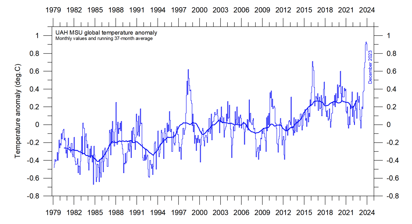
Fig. 20: the 2024.0 tick mark seems to align earlier than the last datapoint of December 2023.
P29 L3 typo: insert “with” after “associated”.
P29 end: re the stratospheric temperature plateau, it would be nice to see a linear regression, which I would expect has a negative slope, though probably not a significant one. This would reassure readers noticing a gentle decline.
P49 L2 after Fig. 42 typo: remove “and”.
P49 bottom: since the association of PDO with global temperature fails to work from 2014 to 2023, I would expect the words here to be criticized, and accusations of “cherry picking” made. I think some additional wording is necessary.
P50 L2 typo: replace “tide” with “cycle”.
Figure 43 SERIOUS ERROR: when I looked at this I thought it did not resemble an AMO graph I made last month. Then I realized, the graph has a label “PDO” on it!
P51 L22: perhaps mechanism 2 should not be ignored, as some datasets allow about 0.3mm/year for it. I see from later text on isostatic rebound that Humlum would be familiar with https://sealevel.colorado.edu/presentation/what-glacial-isostatic-adjustment-gia-and-why-do-you-correct-it but it might be better to integrate such text into a discussion of mechanism 2.
P51 L28 typo: delete “a” and insert “.” before “As”.
———–
Dr John Carr
My comments assume that the intended readership is the educated general public having somescientific knowledge of the environment. The report is very dense and packed with important information in its 70 pages. I find many items which are very interesting and new to me.
My main suggestion concerns the “General overview 2023”. It is possible the typical reader will not get beyond the general overview and so I suggest significant extension of this. In my humble opinion, the report reads largely as a catalogue of unconnected facts which are not put into any context. My recommendation is to change the “General Overview” into a more extensive “Executive Summary”, with in mind that this is all the average person will read. My first proposal is to have an introduction which expands on the points in the current one but goes much further. It could introduce the many topics of the report, giving links between them and anticipating an overall conclusion. Then, I think the paragraphs on each topic should include the useful images. At present, there is text which describes the data without an image and this is very difficult to follow.
Many times a “5.6-year cycle” is referred to but without presentation of the analysis. You say this may be present in El Niño/La Niña, SOI and PDO. Other phenomena have different periodicities. What are the hypotheses for the cycles? The general reader might appreciatesome information on all the ocean oscillation phenomena in the introduction.
Many of the graphs have running averages. For some you say: “simple running 37-month average, nearly corresponding to a running 3-year average.” Why 37 months ? Others have 7 years, why that? The introduction could be a good place to explain all these issues.
There are four groups of graphs with data of the same quantity from different sources: Figures 3 and 4, figure 6 and 7, figures 8, 9 and 10, figure 12, 13 and 14. Would it be possible to display the same quantities on one graph? As is, the data looks very similar and it is impossible to tell if there are differences.
The issues raised in the section “Reflections on the margin of error, constancy, and quality of temperature records” are of vital importance in assessing climate data. Unfortunately, I find it difficult to understand what is being said here. One example is the statement: “The margin of error … and is probably at least ±0.1°C for surface air temperature records, and possibly higher”. I guess this is referring to the Global Mean Surface Temperature and not numbers from a particular weather station. If it is GMST then the error clearly is very different depending on the year since 1850 and also on the period the temperature is averaged over. I think more detail and some references would help the general reader. I had difficulty understanding what is meant by “administrative changes” and what is shown in figure 15. Eventually, I noticed the text in the top left of the figure and conclude the quantity plotted is the difference of temperature value published in Jan 2024 and the value published in May 2008. If that is so, I think there is a clearer way to describe it. Further the plots in the section are from GISS only, while figures 8 and 9 are from HADCRUT and NCDC, so one is left wondering if these datasets have the same changes or different changes. A statement clarifying this would be of interest.
Is figure 26 Tropospheric or atmospheric CO2? I guess there is a typo in the text.
For figure 27, it is said “All three change rates clearly vary in concert”, to me this is not at all clear from this graph. It may be true but it would need a different graph to demonstrate it. This seems an important point and is worth expanding on.
The ocean temperature plots give very important information but I find the presentation rather confusing. Figure 31 shows the temperature variation 0-1900m and the reader initially gets the impression that the temperature at great depth has large annual variation. The later plots show this is not in fact the case. I would recommend reversing the presentation, putting the depth dependence first. Then, giving the regional variations separated into near surface and deep sea. Further, at first sight figures 32 and 33 give opposite impressions. In the first, it seems the great depths have the biggest temperature rises and the second, the low depths have the biggest rises. This is because the scales in figure 32 change with depth which is not possible to see without a large magnification. Figure 33 shows a clear, surprizing, dip in temperature rise at 100m. Figure 34 shows the dip is present in the Arctic but not Antarctic.The report makes remarks about global average of atmospheric temperature make no sense, the same must be even more true for ocean temperatures.
As briefly mentioned above, in very many sections there are statement like: “A Fourier frequency analysis (not shown here) shows the PDO record to be influenced by a significant 5.6-year cycle, and possibly also by a longer 18.6-year long period, corresponding to the length of the lunar nodal tide.” This is a constant theme in the report but without development orconclusion and I think it is a pity to leave the reader in suspense in this way.
———–
Dr. Hessel G. Voortman, M.Sc.
- Prof. Humlum’s report for me is a yearly returning joy to read. I consider it a valuable contribution to the scientific literature on climate change.
- Pg. 51 “Global, regional ….. tide gauge data”. Trends derived from gauges show poor coverage in the early part of the record. Further, differences in registration of sea level over the years may have lead to inhomogeneities in the data, as I show in section 4.3 of my paper on the North Sea. Admittedly, this was unexpected and the problem is as yet unresolved. Possibly, my paper will lead to some follow-up work in the Netherlands. That is currently under discussion.
- Pg. 51 “Global (or eustatic) …. Terrestrial glaciers”. This part of the document is confusing. The opening section discusses Eustatic Sea level rise. Of the four drivers that follow, to my knowledge, 2 and 4 are part of Eustatic sea level and 1 and 3 are not. I think this section needs more explanation regarding eustatic sea level rise and other factors and local versus global effects.
- Pg. 51 “Ocean basin … rise”. I think this sentence is untrue or at least too rash. History reveals that wind is a dominating factor for flooding disasters and acts on a time scale of hours to days. Think of the 1953 floods in the UK, Belgium and the Netherlands and of hurricane Katrina in 2005 in the USA.
- Pg. 51 “Higher temperature …. Surface”. I did not check the numbers here but suggest cross-referencing with the recent paper by Frederikse et al in Nature (https://doi.org/10.1038/s41586-020-2591-3). This part appears to contradict recent research in this matter.
- Pg. 51 “On a regional …. (pg. 52) lost”. The explanation based on a dropping Geoid is very specialized and therefore hard to follow. Consider basing the explanation on the effect of gravity (the large Ice mass pulling the water up so melting drops the sea level)
- Pg. 52 “In Northern Europe .. recorded”. Regarding the reference to Scandinavia, the same effect causes a drop of the land level in my home country, the Netherlands. The same effect is found in Louisiana. Adding those examples would enrich the effects of the GIA in both rising and falling land levels
- Pg. 52 “The relative …. Gauges”; as a coastal engineer with almost 30 years of experience I fully agree with this statement. I explain this in my own paper. Another reference is Parker and Ollier (https://doi.org/10.1016/j.ocecoaman.2016.02.005)
- Pg. 53, figure 44. I consider it dubious to calculate trends over differing time periods as is shown in the top left of the graph. Especially if uncertainties are missing, as is the case here. I believe the graph is not made by prof. Humlum, so the following may be moot. But I would suggest showing the 121-month backward difference to get insight in today’s rate of rise
- Pg. 53 “Satellite altimetry … data”. There are numerous issues surrounding the observation of sea levels from satellites. I found a number of papers discussing the interpretation of the data. They are found in section 2.1 of my paper
- Pg. 53 “The most important …. (pg. 54) somewhat”. This section appears to overlap with some of the text on page 51. And I find the section to be unclear and possibly in part contradicting the text on pg. 51. On pg. 51, GIA is missing from the overview of processes and tectonics is characterised as unimportant on a human timescale. Here it is (justly) argued that GIA is important but not for changes of ocean basin volume but for rising and dropping of land levels. The same is true for tectonics which can cause rapid rise or fall of relative sea level on timescales as short as minutes. The text would improve if tectonics and GIA were added with two potential effects: changes of the volume of the ocean basin (negligible on human time scales) and changes of land level. Of the latter I think we could argue that GIA is a slow (viscous) process and that we do not expect detectable accelerations or decelerations on human time scales. Tectonics however may even lead to shockwise changes of relative sea level
- Pg. 54 “This reduction is performed … “. As far as I know, the reduction is done by the local authorities and the reduced data is provided to PSMSL. At least this is the case in the Netherlands.
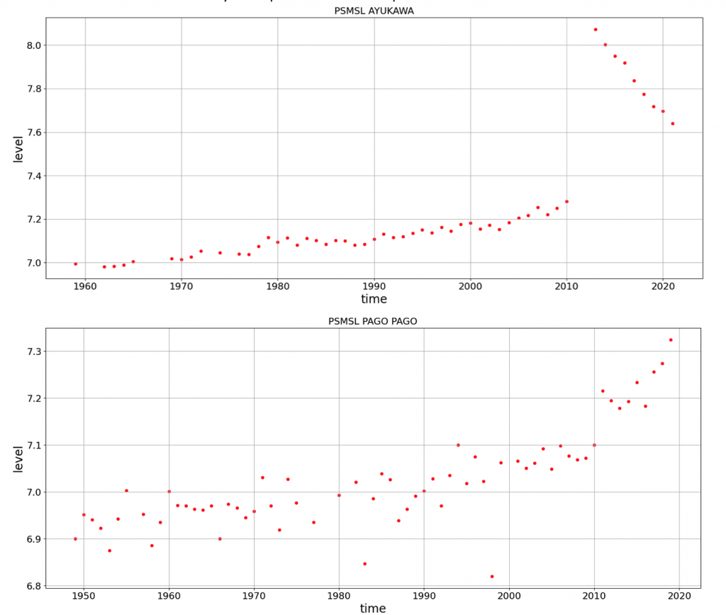
- Pg. 54 “Few places … movements”. Before proceeding I would like to say that I admire the work done by PSMSL and that I recognise the value of this dataset with global coverage. However, there is a lot that the PSMSL does not do and one of them is correcting for tectonic motion as suggested here. To illustrate I created the two graphs below of two locations that were hit by earthquakes in the recent past
- Pg. 58 “Observed (measured) and … Figure 47)”. Because of the small overlap, comparison is difficult. However, as I show in my paper on the North Sea, it is very well possible to derive estimates of the rate of rise in 2020 from the observations. That rate is also provided in the IPCC projections (available in the NASA Sea level projection tool). To my mind, a comparison of rates for the same year derived by different methods can be compared